Choose The Right Color for Your Dealer Website
Have you ever wondered why Facebook is blue? The answer is very simple: Mark Zuckerberg, a CEO and one of Facebook’s founders, is red-green colorblind. Blue is the color Zuckerberg can see the best, so he made it the color for his brand. Can a color be an essential ingredient for success? Sure, there are thousands of examples. So what colors can contribute to your dealership’s popularity and influence your audience in the best possible way?
The use of colors in marketing is based on the psychophysiology of how we, as humans, perceive our environment. 80% of all the information that people get is received visually. In marketing, the role of visual perception is even bigger. The statistics indicate that 93% of buyers make decisions about the final purchase after being guided by the visual impressions of the products; 6% decide to pay after examining the items by touch, and only 1% of customers are motivated by the information received through their hearing.
In Internet marketing a potential buyer has no opprtunity to touch, smell or feel the products, thus, the role of the visual component in the process would be 100%. The influence of colors on marketing processes is hard to overestimate because:
- More than 50% of buyers state that color is the most important factor motivating them to make a purchase.
- A full-colored ad is read up to 42% more than the black and white version of the same advertisement.
- The brand awareness increases up to 80% when the “corporate color” is used.
Here are some “multi-colored” tips for increasing your conversion rates:
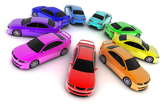
- Men avoid purple, orange and brown. They prefer blue, green, and black colors. If you have more vehicles for men, then make your target page blue, green and/or black. These 3 colors will appeal more to a male audience.
- Women do not like grey, orange and brown colors. They like blue, purple and green. If your target audience is mostly female add shades of blue and purple to your landing page or ad and choose the vehicles in this color palette. Avoid “earthy tones” because it’s been proven that women don’t like them. Brown is associated with humus and fallen leaves. Orange is likened to the color of clay. Such things don’t relate to beautiful imagery in mind. It’s a myth that women adore pink. Just a limited number of females like it.
- Blue denotes trust. Blue has the meaning of peace, order and loyalty. It is the “corporate color” of big businesses and big politics. It is associated with calmness and serenity. People perceive it as a “peaceful,” “calm,” and safe color. It tells the viewer something like “Believe me and trust me. I’m reliable and honest”. You can easily use blue on your landing page/website and for your ads to chase away any possible worries, fears and doubts your customers may have.
- Yellow signifies caution, the color of alarm. Some psychologists state that yellow is a color of happiness and many brands use it to show that they are interesting and friendly. But it is a well-known fact that this color stimulates the excitation centre in our nervous system and activates the centre of anxiety in a human’s brain. Use this color for designing the Call-To-Action elements (CTA). You will create a slight anxiety and stimulate your visitors to take some action.
- Green is nature itself. Green is most commonly associated with open air, ecology, nature and the environment. It also stimulates a burst of creativity. You are free to put green on your webpages and advertising campaigns the way you like. This color is an ideal choice for the CTA button because it also has an established reputation as a safe but dynamic color. Positive meanings of the “green” word, such as “environmentally responsible behavior”, “care for Mother Nature”, etc. have strong roots in the public consciousness. They will help you create a favorable aura around your business.
- Orange is a joyfulness that forces you to hurry up. The positive side is that orange is perceived as cheerful. It stimulates physical activity, the readiness to compete and win, and incites self-confidence. It is not by chance that orange is so widely used in the emblems of sport teams. It is a “loud” and “warm” color. But sometimes it can have a meaning of something cheap. If you want your vehicles, services and ads to cause a burst of interest and big sales in the auto market do not use orange in your marketing campaign. You can paint your banner with an orange tone if it says that your special offer is “for a limited time only”. The chosen shade will increase the urgency to do required actions, and will make this marketing message more noticeable and effective.
- Red is the sun and warmth. It is a hot color that gives you liveliness, energy, courage, and strength. Red stimulates our central nervous system and thus, is associated with strength, rage, vigor, power, passion, desire and love. An excess of red provokes an overwhelming effect. So do not overuse it. You can focus a users’ attention on important objects by coloring them red. These spots can be messages that transmit valuable information.
- Black is luxury and value. It is a color of elegance, refinement, and power. Black gives you a feeling of luxury and beauty. It inspires everyone who visits the websites of automakers. Black is also an eternal and classic color. If you sell expensive luxury cars or other A class vehicles, then a strict black tone or a simple black-and-white palette for your landing page, website or marketing campaign is the best thing that you can think of.
- White is freedom. One of the most popular websites in the world is Google, which uses white in its interface. The best sites of our modern era follow Google’s example and add a lot of white space to their webpages. It’s because the white emptiness associated with white creates a sense of freedom, a wider area and openness. You can also use it as a background. It will comfort a visitor’s eye.
- Use bright colors for your calls to action. According to statistics, the maximum converting colors for the CTA-elements are bright colors, such as red, green, orange, and yellow. There is a certain consistency for any color: dark shades don’t convert people as good as the lighter ones. Such “unaesthetic” and “psychologically ambiguous” colors, such as yellow and orange, attract more users’ attention than their “harmonious” and “elegant fellows”. If your purpose is to draw a visitor’s attention to your inventory, a big orange or yellow CTA-button on the landing page is not a bad idea.
Autoxloo provides a wide range of services for your inventory presentation and promotion. Our Make-A-Page 2.0™ platform offers you a nice variety of layouts and tools to create the necessary website elements and to design it to your taste and needs. You can make your dealer site unique and effective so that you will leave your competitors miles behind. Autoxloo can quickly and easily reveal your business’s potential and its capabilities.